Narrowboat Storage Solution & Step by Step Canal Art Tutorial…
This has been a very enjoyable project and for me a special first too. While Mum had a great many commissions over the years this is the first one received for me.
The Commission…
It was back in November 2018 that I received an email asking:
“My husband and I own a narrowboat, 42 ft so space is important. It came with everything on it, and we are gradually making it our own with our own items. We don’t have a lot of surface space in the kitchen area and a lot of it is taken up with a big wooden bread bin.
We want to replace this with something that a loaf of bread can fit into when turned on it’s end, and for it to be in canalware. Is this something you could do please.”
As it happened…
A few days earlier Dad had dropped into me the remaining contents of what was once a shed full of vintage pieces. These he and Mum had purchased at various boot fairs and other markets over the years.
Regular readers will know why Mum won’t be able to complete these projects herself now, but nonetheless, it’s great that I myself can give these very old items a new lease of life and perhaps more loved than ever.
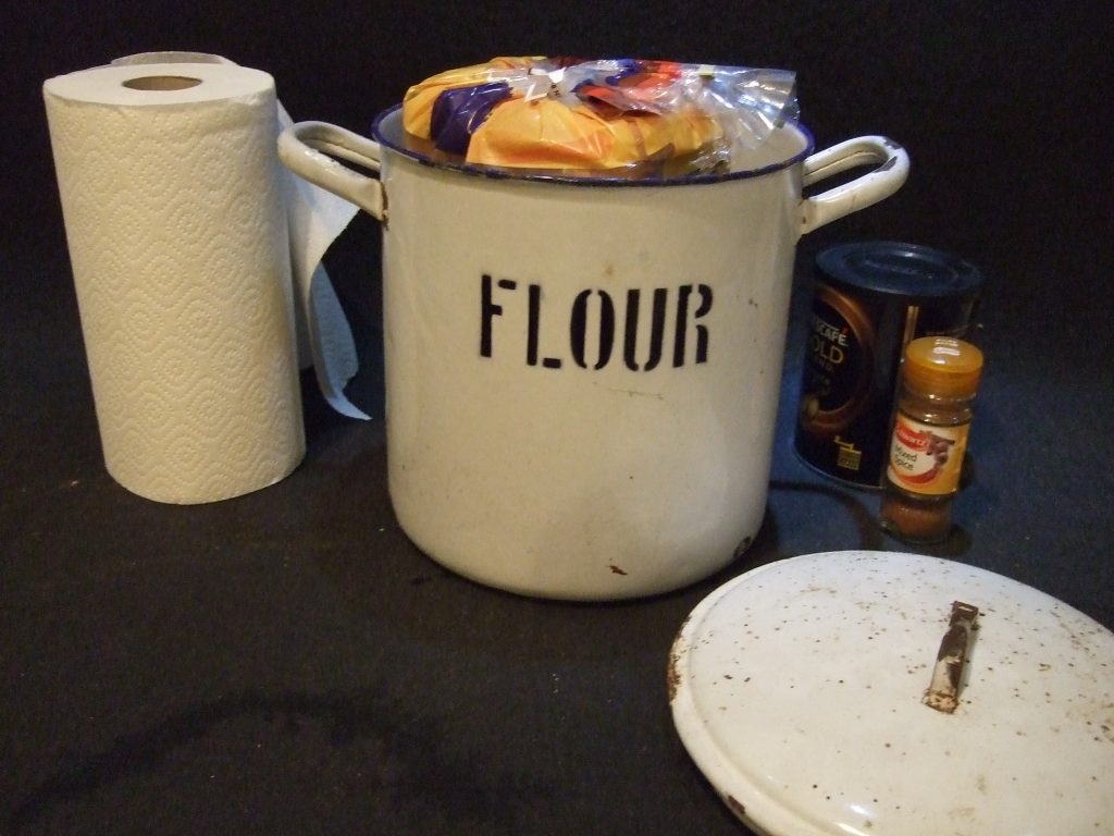
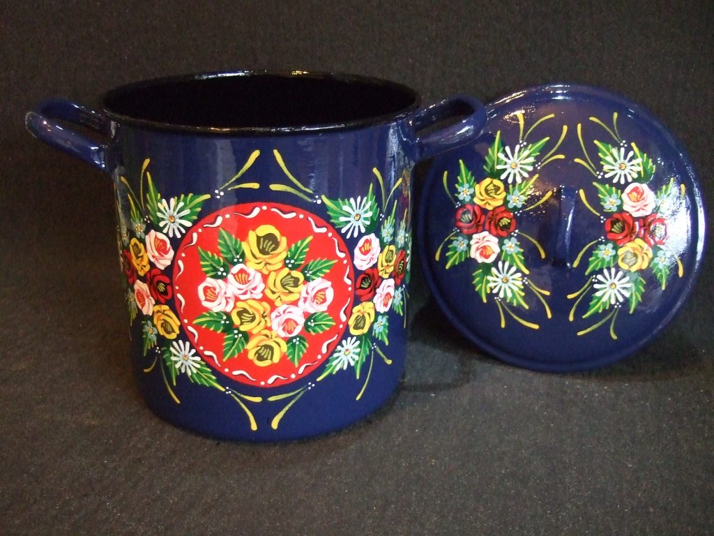
At what must be at least fifty years old already. I looked at this sad enamelware flour bin and wondered of it’s past life and if it could speak, what tales it could tell?
The Pitch…
So by way of good fortune and a new loaf in my cupboard, I grabbed my camera and sent this photo attached to my reply with a quote.
The idea and the quote met with approval and fortunately it wasn’t needed until the 2019 cruising season. This was great because I couldn’t make a start until the Christmas break.
Getting Started…
The first task was an hour or so “gently does it” with the angle grinder. Then a treatment with some rust converter for the stubborn areas. The handle on the lid was bent so this had to be straightened out too.
The enamel on this piece is unusually thick so it needed a great deal of primer coats to make up for the missing enamel and these were sanded flat between each coat.
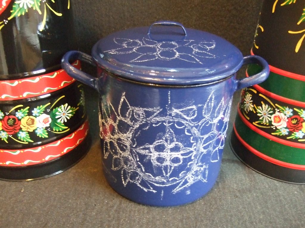
Eventually the piece was ready for painting and at this time all I knew was that the buyer’s boat had a blue theme. So blue on the outside and I decided on a contrasting black inside including the base’s lip to echo it’s former life image.
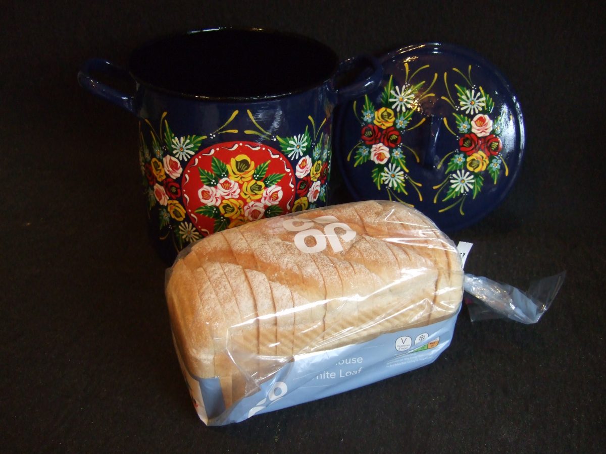
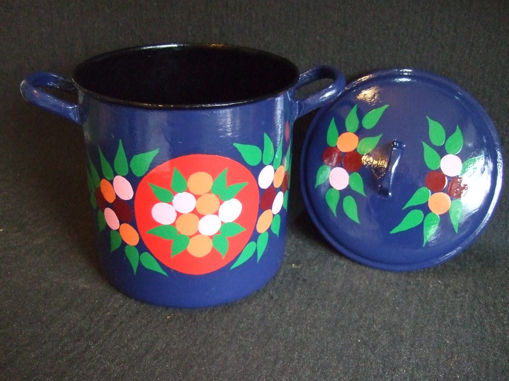
Now resplendent in it’s top coat, I chalked out a very rough plan for a hoped eventual design which I would seek approval for by email. I did indicate that I’d like a free hand so I only really gave two general options similar to a couple of completed coal hods. My preferred choice of a design based around a red circular panel was chosen by the buyer.
I made two stencils for the red panels, one for each side but on painting the paint bled under the stencil in places. No matter really, I had to over-paint those bits but at least the resultant circles were perfect.
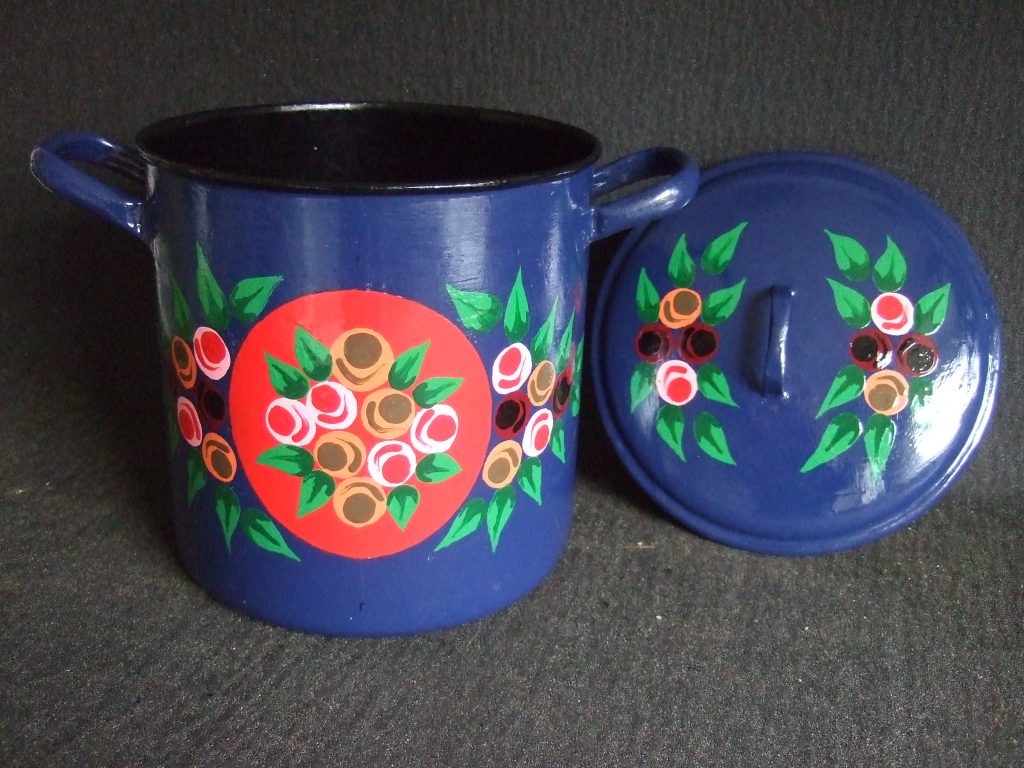
Layer One…
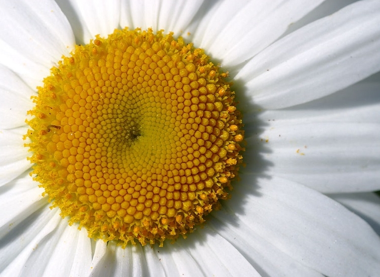
Once the red panels had fully dried it was onto the first layer of decoration. I mention on the home page in the history of this ‘folk art’ that this is strictly a ‘craft’ as opposed to ‘art’ because ‘Roses and Castles’ follows some basic rules. Actually, I twist these just a little bit but in a very common way. So white roses start with a pink base, red roses sit on a burgundy base and the yellow ones on an orange or brown base.
Obviously red roses can’t be put onto a red base colour. Thus the red panels only get white and yellow roses.
As in nature, leaves come in a variety of shapes but I follow on from Mum with the more “pointy” style. I sometimes need to use a lighter shade of green but this No.2 is the one I mostly use for the first of the three layers.
Layer Two…
This is the “shadow layer” and while it largely goes un-noticed in the final vision, it is what gives this craft such depth and impact. It is therefore critical and will dictate the positioning of the top layer.
Again the colours of the rose shadows are generally rule driven, red, brown and black respectively for the roses.
For the leaves where possible I’ll use green No.3, of course I can’t use this if that is the “base colour” of the piece. In this case I’ll use a dark brown instead. Mum on the other hand always used a light brown as a matter of course. Other painters use black.
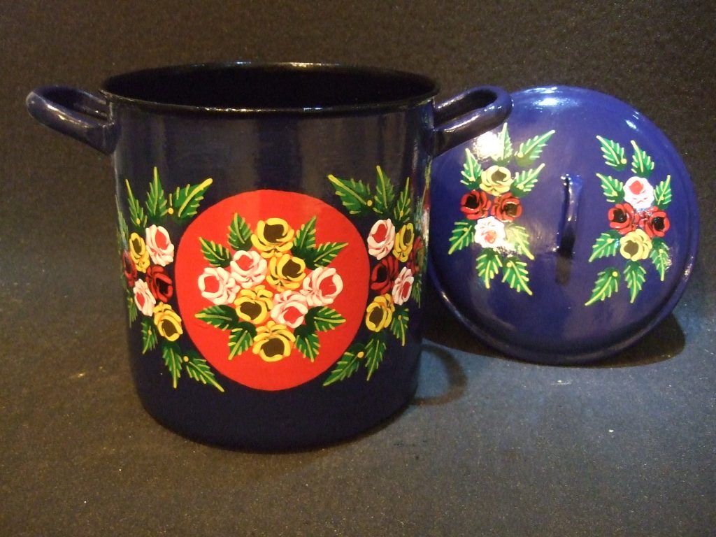
Layer Three…
This is the most exciting layer as we finally get to see whether we have success or not. The rose petals evolve depending where the previous brush stroke ends. So no two will ever be the same and differ in subtle ways.
With a great deal of practice the roses become signature like. Many painters can identify each other’s work with remarkable ease.
Finishing with the yellow roses and being careful not to touch them, the veins of the leaves are added. Then the centres for the daisies and forget-me-nots are placed. Additionally the daisy centres are given a pale blue border (not shown in the next photo.)
Painters differ with the style of leaf veins as I differ with Mum’s. I looked to do something different from other painters and came up with this style. I think it’s unique to me but I could be wrong. For anyone following this tutorial, I’m not precious about it. So if you want to copy my styles here please do go ahead.
Layer Three Petals…
This is not a fourth layer, indeed it can all be done within layer three. Myself I let everything dry again before doing these final flourishes. This is because all too often a misplaced hand can cause disaster.
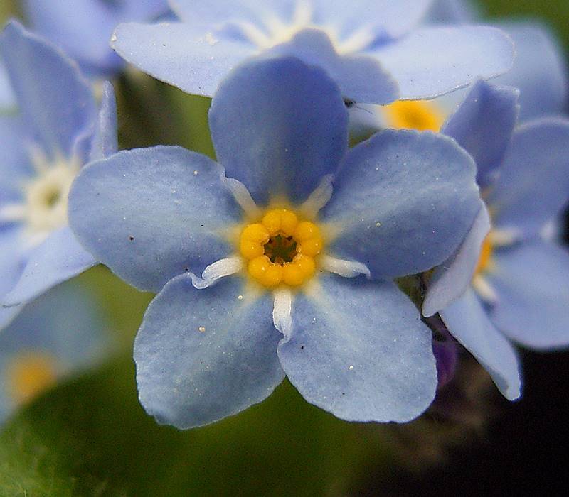
For the forget-me-nots five blue petals are placed around each yellow centre. The centre itself gets a red dot in the middle and white dots between each petal. These represent those in the real flowers except in nature the tiny centre mark is black.
On smaller pieces I’ll replace the blue petals for white and treat them as daisies instead. That’s despite the fact that some forget-me-not varieties are white. Again I think this is another homage to Mum’s work really and not especially traditional.
The daisies get their petals and a red offset dot or crescent to their centres. I really don’t know for sure why this red crescent is put there. It seems to be quite universal and attractive. Possibly it’s a shadow since in nature these are quite domed. Or because the underlying structure is reddish in colour?
Layer Three Final Flourishes…
Without over-doing it a series of triple white dots are added. These represent gypsophila. They give the same effect as they do in traditional flower arrangements. Not all painters include these but Mum often did so I carry on. Interestingly she didn’t know what they represented until I found out and told her.
Finally I add the yellow flashes and at least three stamens to the centres of each rose. The decoration is complete and once dried can be varnished.
Varnishing…
After fully drying for at least three days I’ll give it a wipe with white spirit. This removes light finger smudges and evidence of any corrections. Doing this any earlier will wipe off some of the work.
I’ll always use outdoor gloss varnish because I never know where the buyer will keep the piece. I try to get a nice thick coat for durability. Once done I will keep turning the piece for and hour or so to prevent runs.
This time I varnished the inside last and went shopping… Bad Move!! On my return I found a puddle in the bottom to scrape out. This made a right mess. It had to dry fully before I could rectify it with sandpaper. Then another light coat of varnish. All finished!
[smartslider3 slider=3]
In Conclusion…
The reasons for this post are many and a big one is to remind google that I’m still here. All being well it will attract more traffic and possibly some sales.
But the biggest reason is that while sadly Mum no longer really understands what I’m talking about, this page should look great printed off and I think might be a useful help to Dad.
I’m hoping he’ll take a printed copy when he next visits Mum and reads it to her. I also hope it shows him that I truly still appreciate him too. The last year was very stressed and emotional, mistakes made and tempers often lost. Regrettable things said all round.
I got the idea over Christmas 2018 while reading my card to Mum. As a result our home page “The History of Canal Art” was further researched and expanded. I carry a printed copy of it on my own visits.

If you’ve enjoyed this read, please think of my Dear Mum Sheila the ‘shei’ in ‘Carishei’ and consider perhaps making a small donation to a dementia charity of your choice one day.
Thank you for reading this post to the end.
Paul
Please feel free to leave a comment using the form below.